
➕ Extended Widget Placement
Maximize the impact of your campaigns by placing Fundpop widgets where they drive the most attention and conversions. This guide centralizes all placement options and provides a concise overview of each widget.
Overview
- Objective: place the right Fundpop widget in the right context
- When to use: you want higher visibility, relevance, or conversion for campaigns
- Prerequisites: Fundpop installed, at least one active campaign, Theme Editor access
Quick setup
- Open Fundpop → Widgets
- Choose a widget → Manage
- Configure placement/visibility rules
- Preview in the Theme Editor (if applicable)
- Save and test on storefront
Placement rules and targeting
Homepage pinning
Pin a single campaign to your store’s homepage to instantly highlight it.
- Only one campaign can be pinned at a time; pinning a new one replaces the previous
- Best for major launches and seasonal pushes
Steps:
- Open the campaign in your dashboard
- Find “Pin Fundpop widget on store homepage”
- Click “Pin campaign”
You can also pin the Reward Tiers Widget to highlight contribution options directly on your homepage.
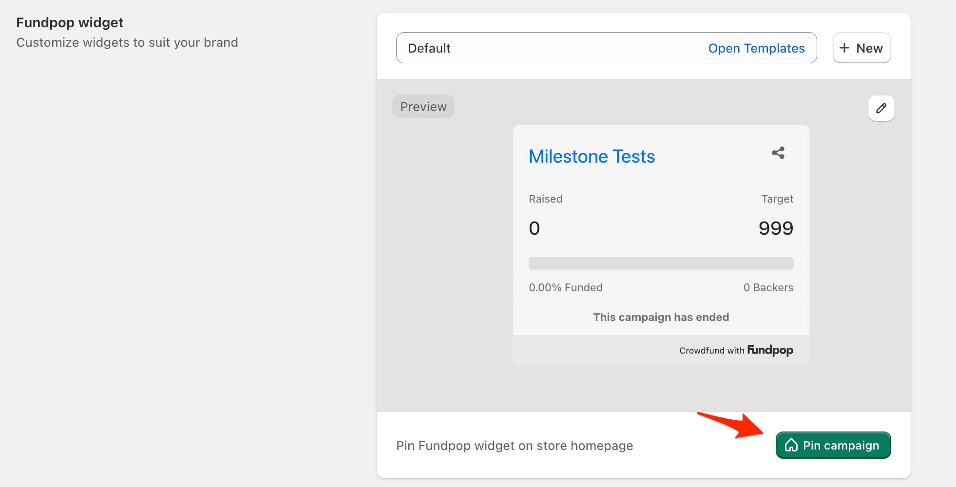
Pin your most important campaign to your store's homepage for maximum visibility
Choosing the right widget
- Featured Campaign Widget: spotlight one campaign across key pages
- Campaign Collection Widget: gallery of multiple active campaigns
- Reward Tiers Widget: tiered contribution options with rich media
- Product Card Progress Bar: compact progress on product cards/lists
Widgets
Featured Campaign Widget
- What it is: highlights one priority campaign across your store
- Best for: major launch, limited-time offer, flagship campaign
- Expected outcomes: homepage traffic to campaign, improved awareness
- Recommended placements: homepage sections, high-traffic landings
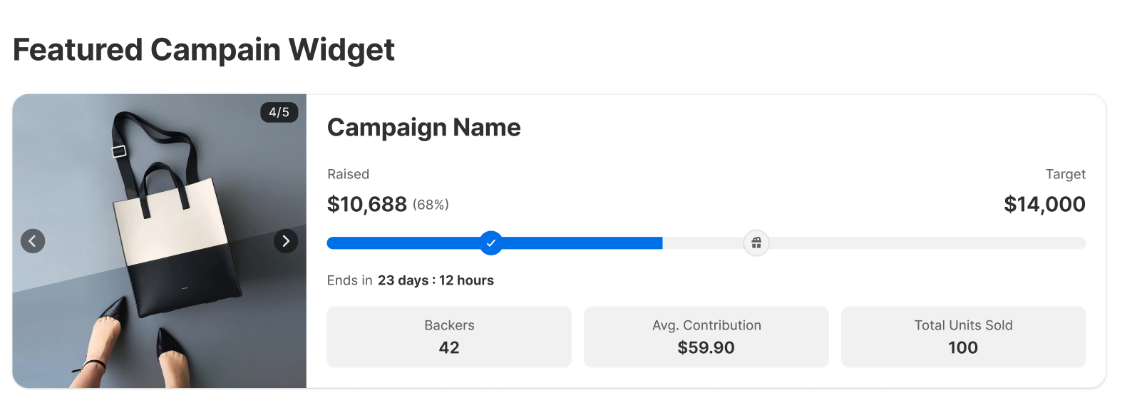
Use a homepage section to spotlight a flagship campaign and drive clicks
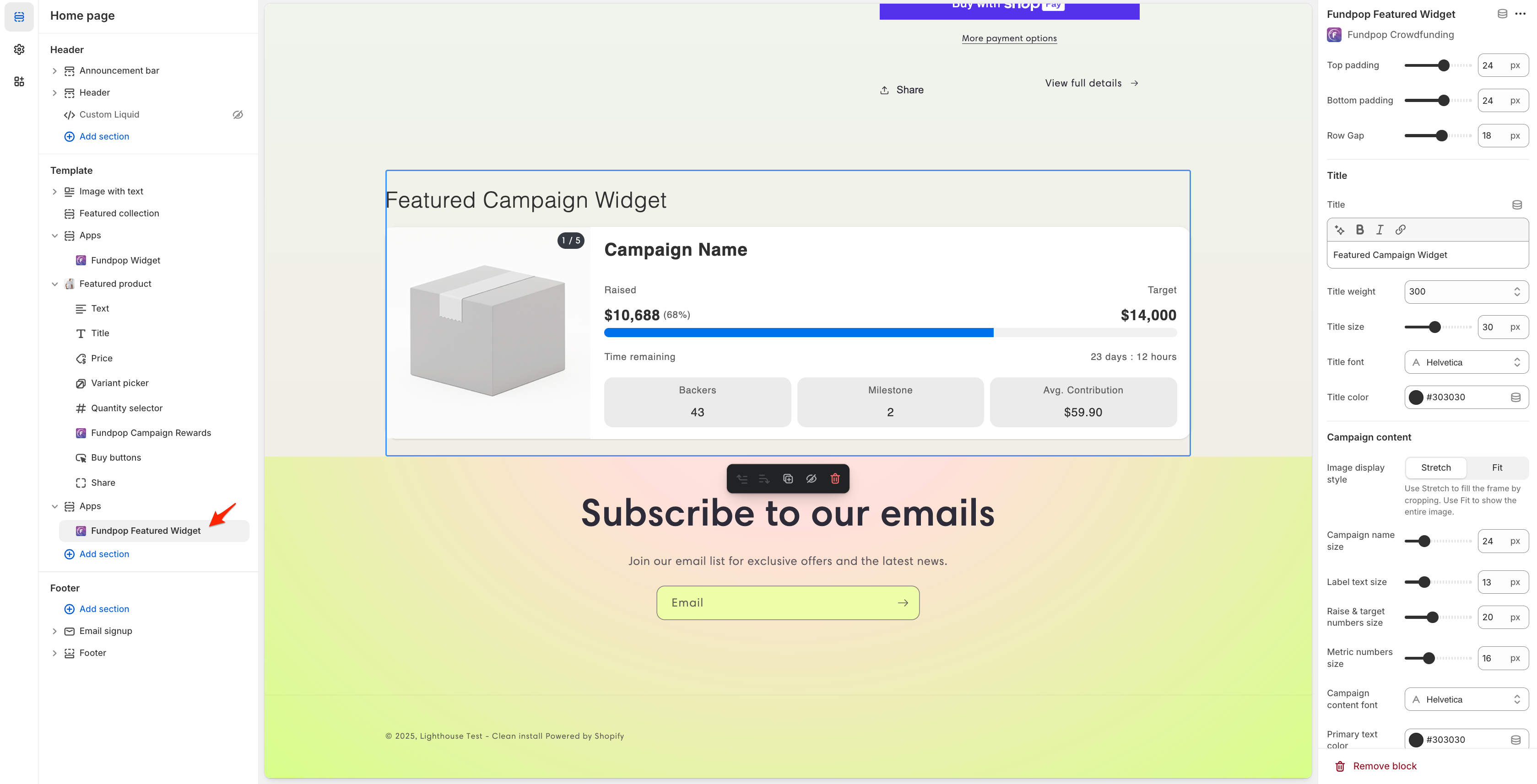
Adjust placement and CTA in the Theme Editor sidebar to match your layout
Campaign Collection Widget
- What it is: a gallery showing multiple active campaigns
- Best for: discovery and exploration of all initiatives
- Expected outcomes: more visits to individual campaigns, broader awareness
- Recommended placements: “Our campaigns” page, landing pages, homepage section
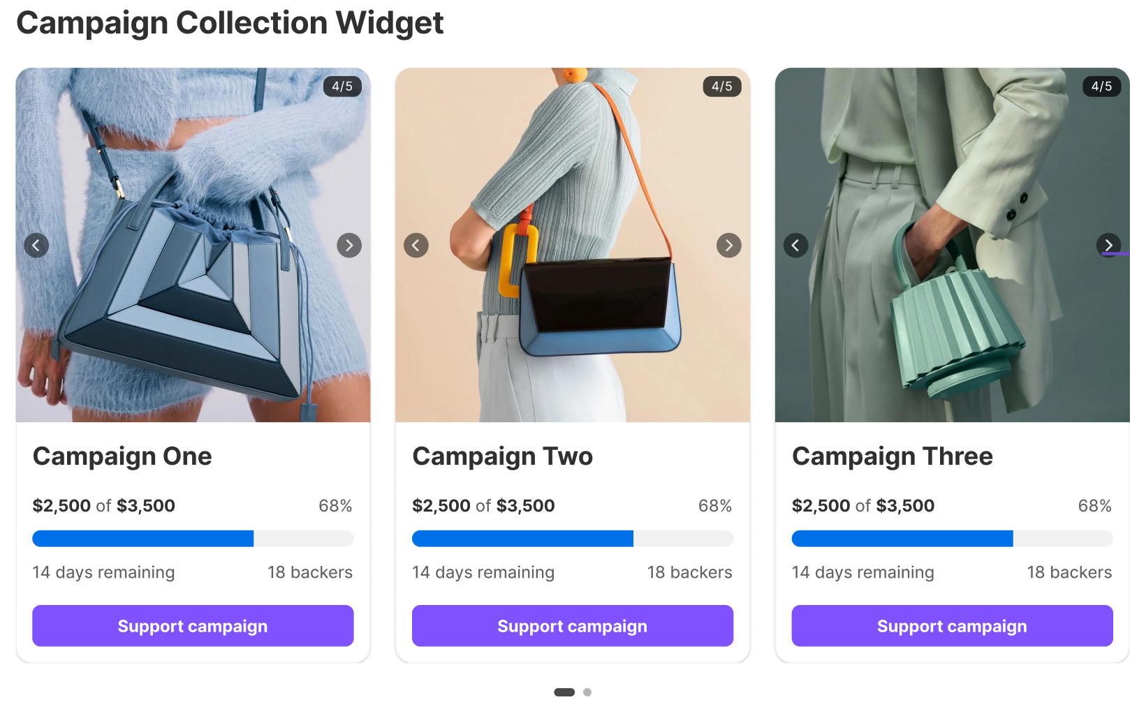
Let shoppers browse all active campaigns in one place with a gallery
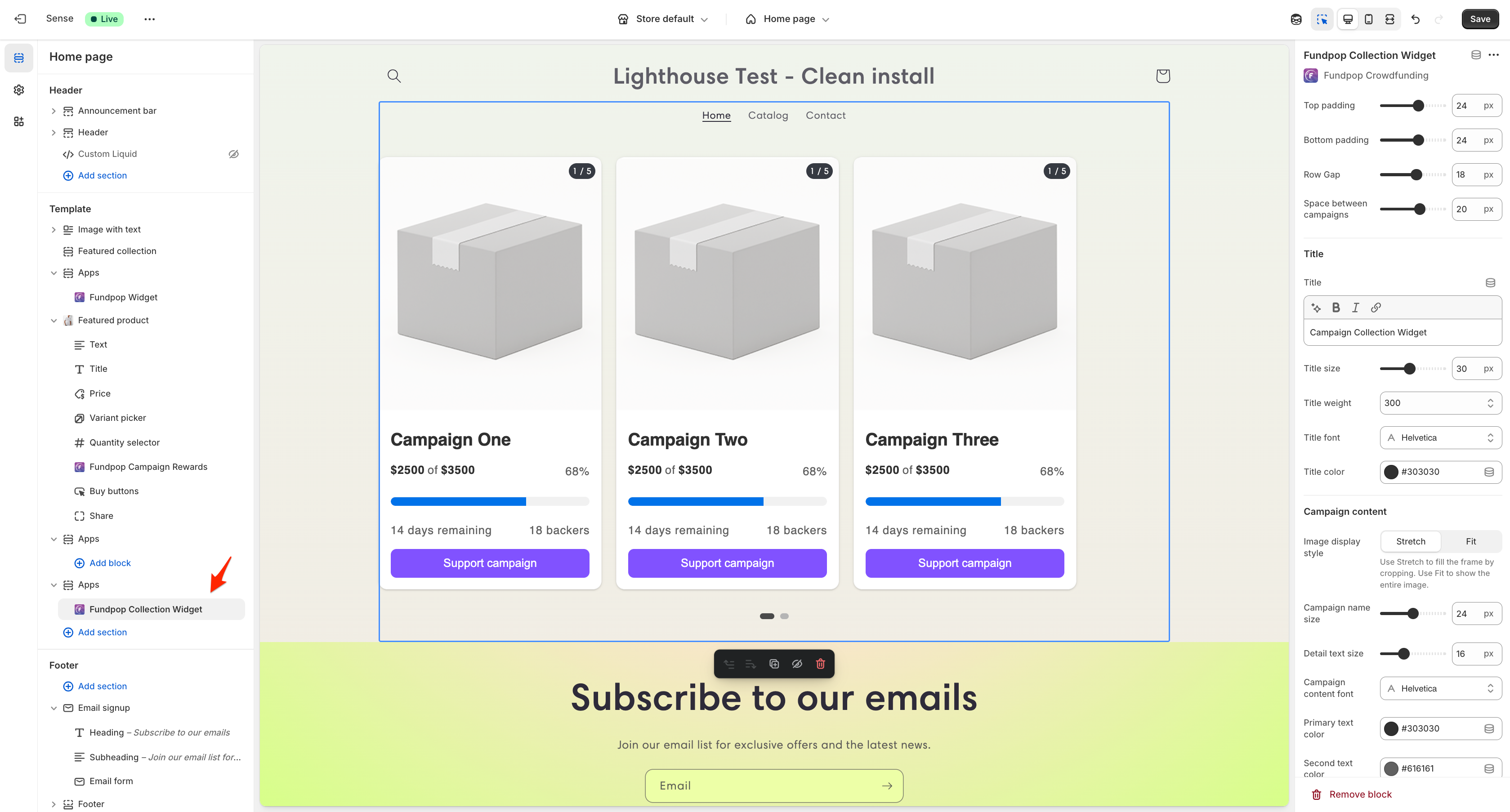
Tune card density and layout in the Theme Editor to fit your catalog
Reward Tiers Widget
- What it is: tiered contribution options with variant-specific images and a premium modal
- Best for: campaigns with multiple perks/tiers
- Expected outcomes: higher average contribution, clearer value communication
- Recommended placements: PDP, campaign landing pages
- Homepage option: can be pinned to the homepage to promote tiers upfront
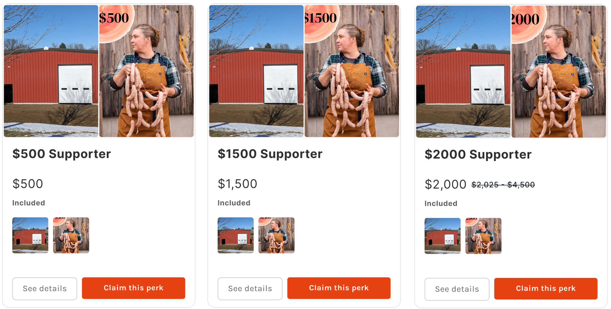
Present tiers in a grid so shoppers compare perks at a glance
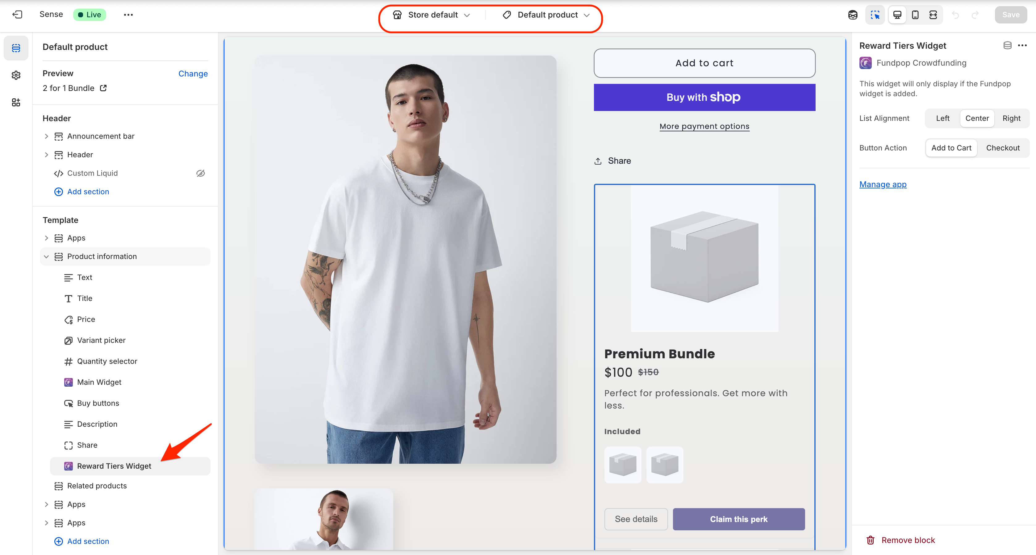
Choose alignment and button action to steer shoppers to PDP or Quick Add
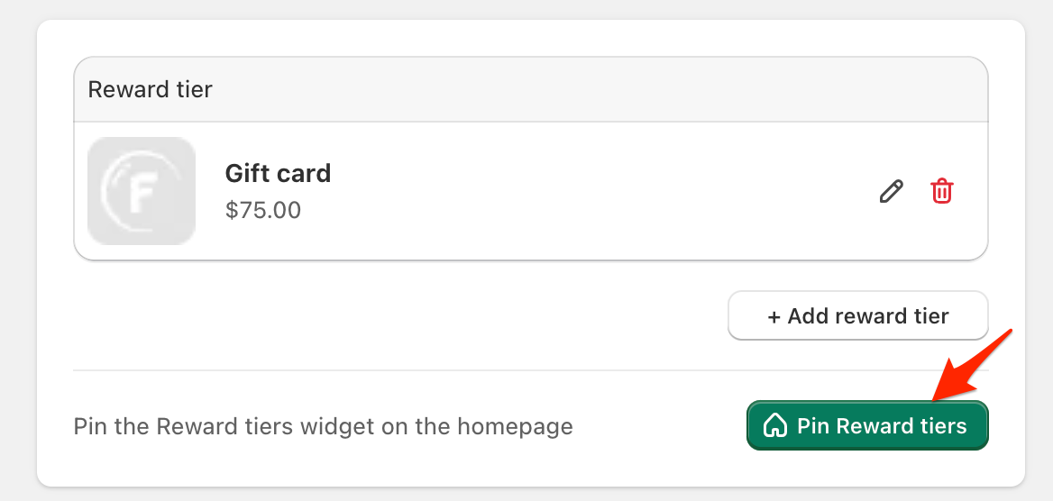
Pin tiers on the homepage to promote best‑selling perks early
Product Card Progress Bar
- What it is: compact progress bar on product cards/lists
- Best for: collection pages and product lists with high scan behavior
- Expected outcomes: increased CTR to PDP, social proof at a glance
- Recommended placements: collection grids, featured product lists
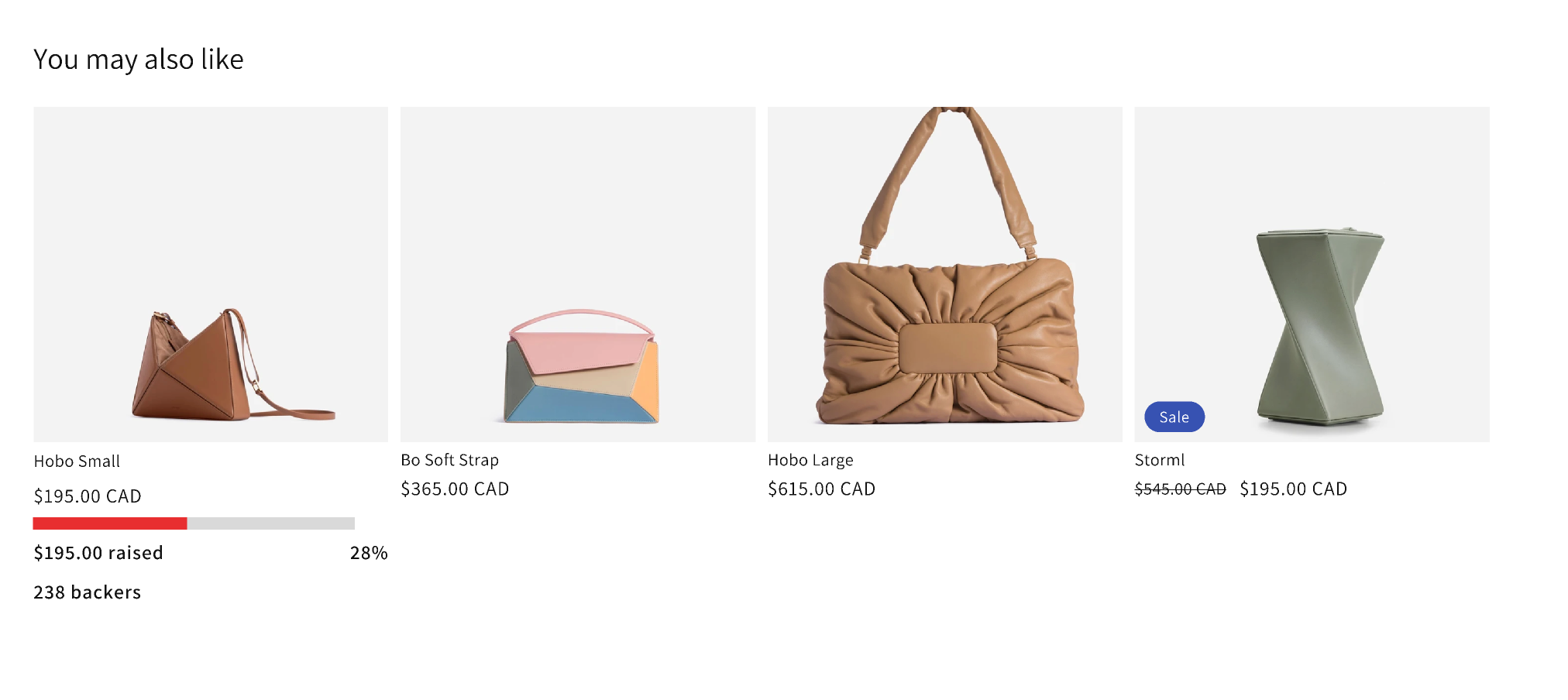
Add progress bars to product cards to surface momentum and social proof
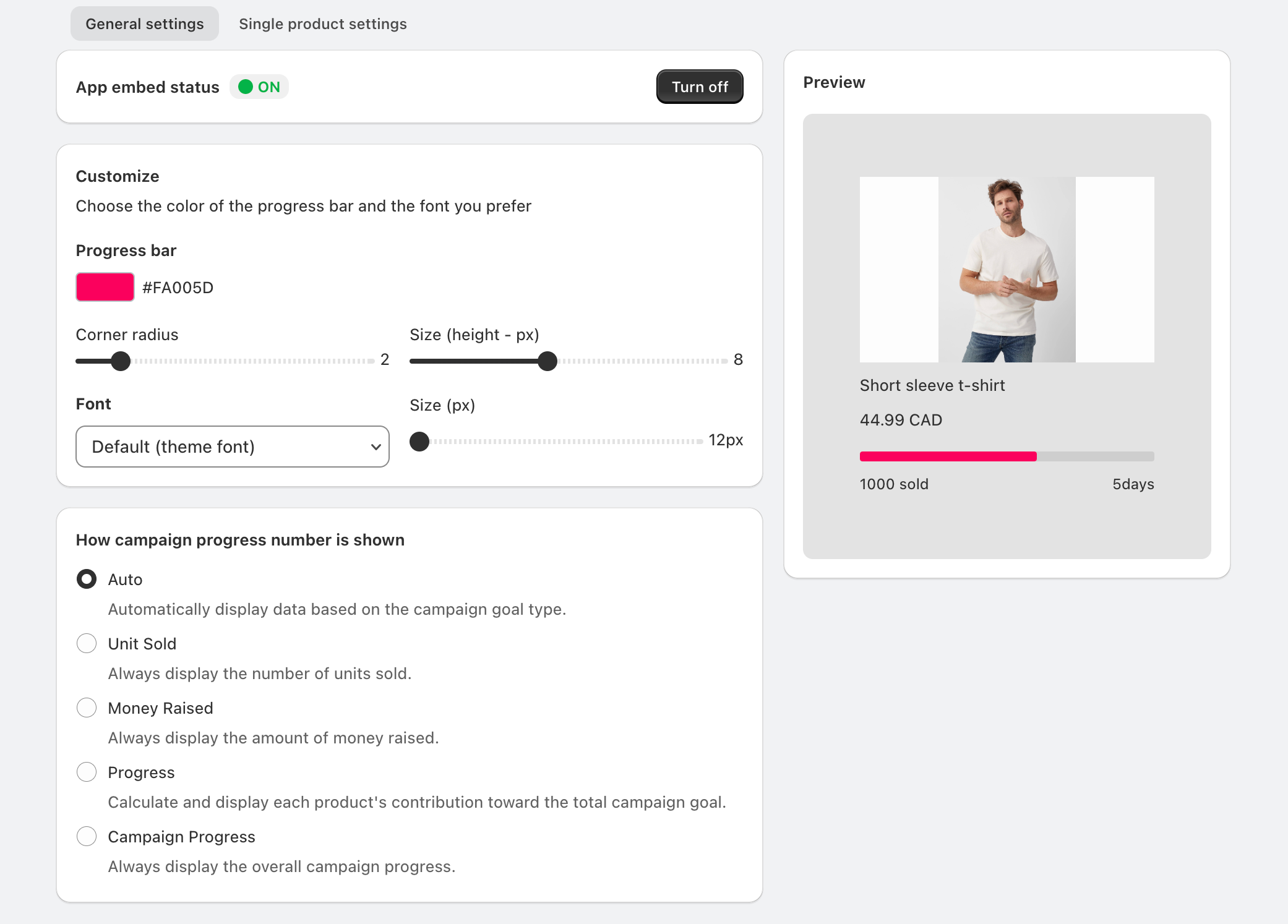
Customize bar color, radius/height, font, and the progress number displayed to match your theme
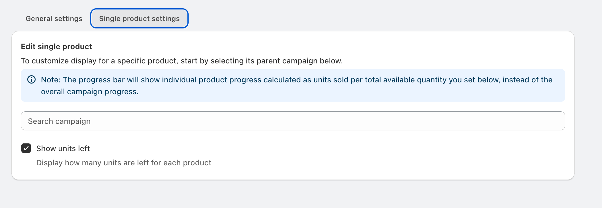
Enable “Show units left” on single products to add urgency